Intermediate

2022 Week 14 | Power BI: Create an achromatic report

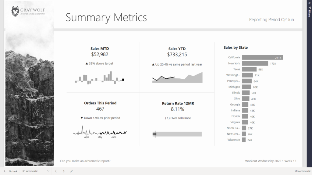
Introduction April is colour month for Power BI Workout Wednesday 2022. First up we are going to try our hand at creating reports WITHOUT hue. Using a file from a previous challenge, can you create an achromatic report that uses contrast and lightness effectively? There will be some creative freedom involved in this challenge, no […]

2022 Week 14 | Power BI: Create an achromatic report Read More »

2022 Week 12 | Power BI: Build a Slicer Panel

Introduction Welcome back to Workout Wednesday – we’re glad you’re here! This week, we’re continuing on with our project management theme. We’re tracking project progress using data generated from Microsoft Planner. Using Power BI with Planner (as opposed to using the inbuilt charts) enables us to both customize visuals and to view more than one plan at

2022 Week 12 | Power BI: Build a Slicer Panel Read More »

Line chart with vertical reference line

2022 Week 03 | Power BI: Can you visualize percent difference from a selected date?

Introduction This week we are taking a page from the Tableau team and looking at how a metric has changed from the value at a specified reference date.  Requirements Create a line chart showing percent change of the close price from a selected date.  Use a slicer or other visual to allow users to change

2022 Week 03 | Power BI: Can you visualize percent difference from a selected date? Read More »

2021 Week 45 | Power BI: Create a Custom Navigation Experience

Introduction We hope that you had a lot of fun last week re-designing Spencer’s report! This week we’re also focusing on design and creating a custom navigation experience using bookmarks and buttons.  I am looking for a new place to live and stumbled upon the 2017 State of American Well-Being report. This PDF report details community well-being

2021 Week 45 | Power BI: Create a Custom Navigation Experience Read More »