2025 Week 33 | Create a Circular Heatmap with Deneb
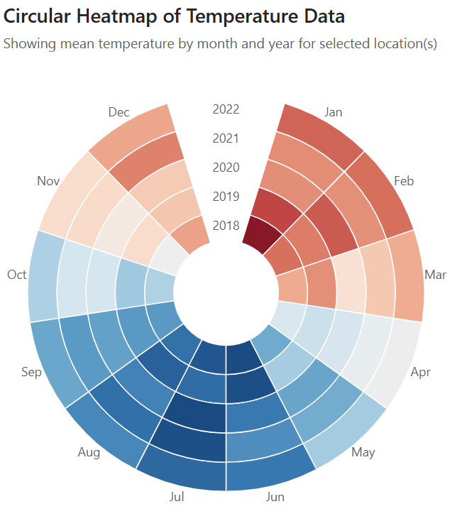
Introduction It’s good to be back again, and a bit sooner than last time! This time, we will be creating a visual using Deneb. Deneb has featured a lot in WoW, which I’m very grateful for, but I’ve yet to submit and exercise for it. As such, I wanted to try something that would help […]
2025 Week 33 | Create a Circular Heatmap with Deneb Read More »